Table of contents0% read
Your logo will appear on your website, social media, business cards, invoices, signs and maybe even your vehicles. Changing it later is expensive and can confuse customers, so it pays to get it right the first time.
This guide explains what makes a logo effective, the main types to choose from and the practical details many business owners miss.
What makes a good logo
Simple
The strongest logos are easy to take in at a glance. Too many details, gradients or tiny text make a logo hard to read on a phone screen or a small business card.
Memorable
A good logo has one distinctive idea that sticks. It might be a clever shape, an unusual letterform or a strong colour, but it should be something people can picture later.
Versatile
Your logo needs to work in full colour and in one colour, on light and dark backgrounds, as a tiny social media icon and on a large sign. Test it in all of these situations before you commit.
Timeless
Trendy effects date quickly. Aim for a design you will still be happy with in ten years, and let your marketing carry the trends instead.
Appropriate
A logo should suit your industry and your customers. A playful style might be perfect for a children’s party business and completely wrong for a law firm.
The main types of logo
- Wordmark: your business name in a distinctive typeface. Great when the name itself is memorable.
- Lettermark: initials or a monogram. Useful for long business names.
- Icon or symbol: a standalone graphic. Works best once your brand is well known.
- Combination mark: an icon paired with your name. The most flexible choice for most small businesses.
- Emblem: text inside a badge or crest. Classic, but it can be harder to read at small sizes.
Our advice: most small businesses do best with a combination mark. You can use the full version on your website and signs, and the icon alone as your social media profile picture.
Choosing your colours
Colour has a strong effect on how people feel about a brand. Blues and greens often feel calm and trustworthy, reds and oranges feel energetic, and black feels premium. More important than any rule is choosing colours that set you apart from your direct competitors.
Stick to one or two main colours with one accent. Always check that your logo still works in black and white.
Picking the right typeface
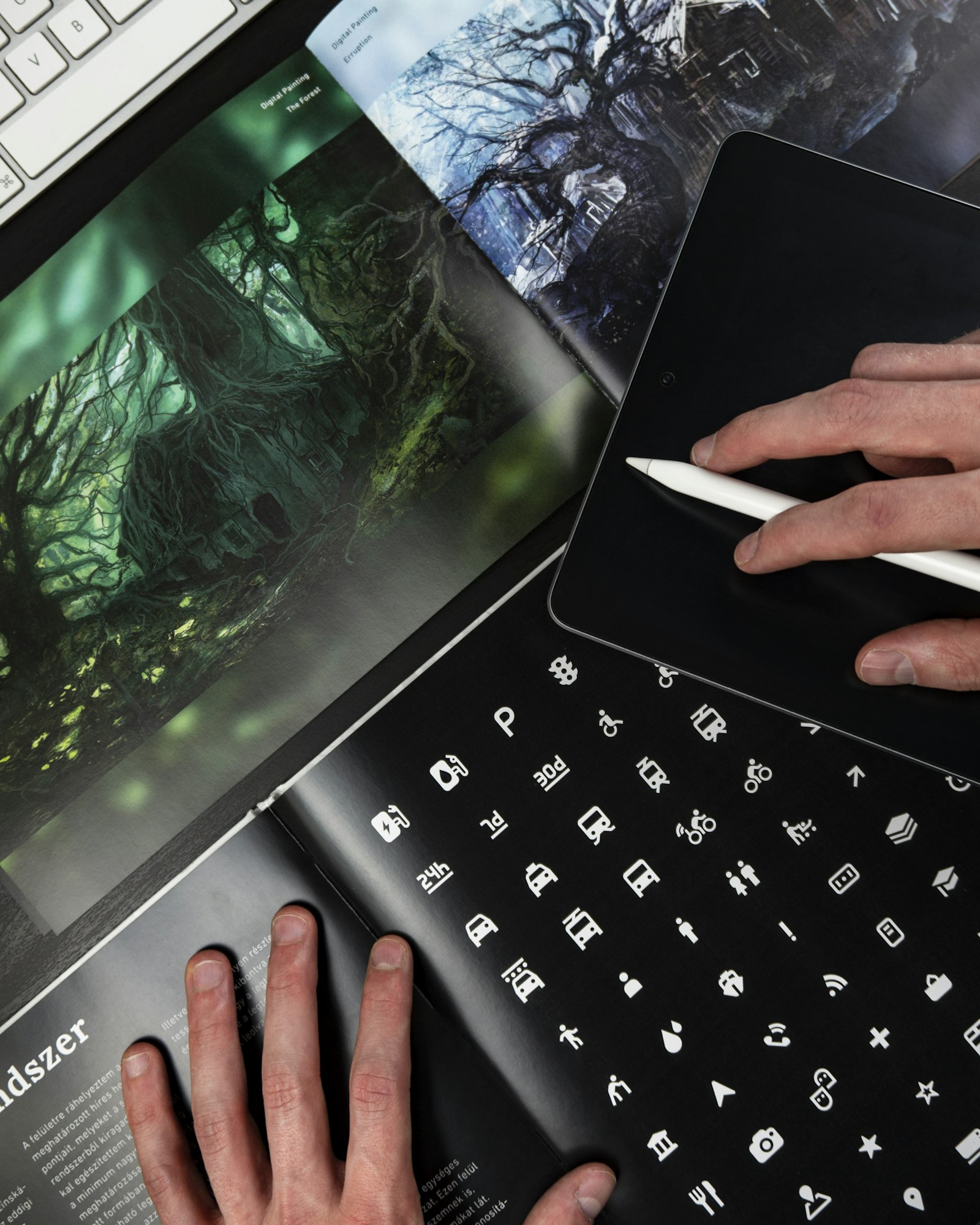
Fonts have personality too. Serif fonts can feel traditional and established, sans-serif fonts feel clean and modern, and script fonts feel personal but can be hard to read. Whatever you choose, make sure your name is clear even at small sizes.
The design process
A good designer will start by asking about your business, your customers and your competitors before sketching anything. Expect to see several different concepts, then a round of refinements on your favourite. Ask to see each option in context, such as on a business card, a shop sign and a phone screen.
Files you should receive
Many business owners only get a single image file and run into problems later. Make sure your final package includes:
- Vector files (SVG, AI or EPS) for printing at any size
- Transparent PNG files for websites and documents
- A PDF version for printers
- Full-colour, one-colour, black and white versions
- Your exact colour codes (HEX, RGB and CMYK)
- The names of the fonts used
Mistakes to avoid
- Copying a competitor’s style too closely
- Choosing a design only because it is fashionable this year
- Using too many colours or fonts
- Relying on cheap clip art that others can use too
- Skipping a test of how it looks at small sizes
Final thoughts
A great logo is an investment that pays off every time a customer sees your business. Take your time, test it properly and work with a designer who listens. If you would like help, take a look at our logo and brand design service.